groundbreaking visual effects


The Goal
Zack needed a straightforward portfolio that clearly introduces him as an artist and communicates his unique mix of physics, visual effects, and audio experience. We focused the site on a strong “About” narrative so visitors immediately understand who he is and what he brings to projects.
We also needed the work to be the main event—easy to scroll, easy to take in, and supported by just enough context to frame the style and themes behind it. The goal was a clean path from “who is this?” to “show me the work” to “how do I contact him?”
Tools Used

Delivered Value
We turned Zack’s story and philosophy into concise sections that are easy to read and don’t compete with the visuals. That structure helps potential collaborators quickly connect the work to the ideas behind it—like AI, abstraction, and psychedelia—without digging around.
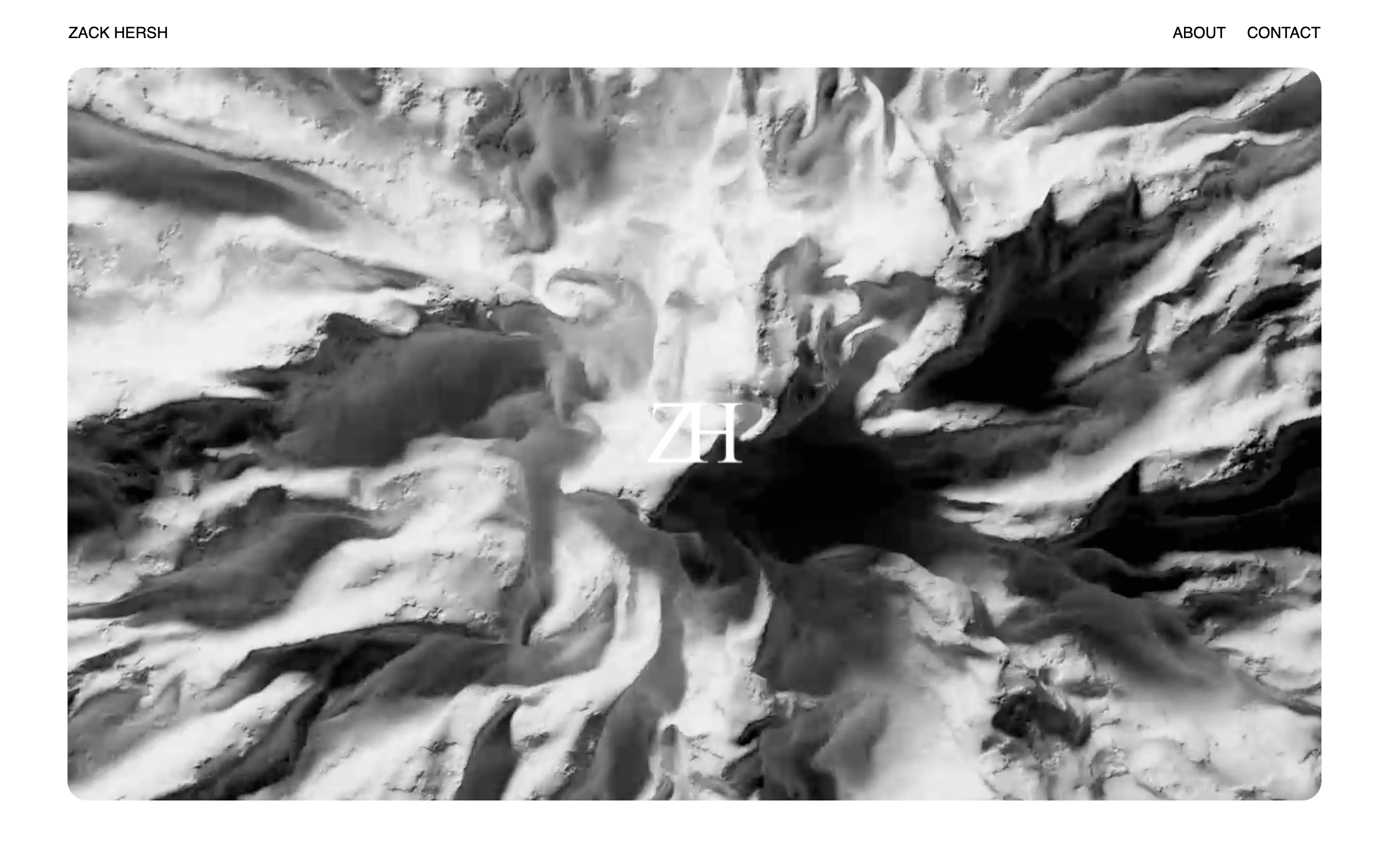
We built the experience around simple navigation and a gallery-forward layout, so visitors can browse the feed naturally and reach the contact details without friction. The result is a portfolio that feels focused, intentional, and easy to use on any device.
Clear artist intro
Visitors get a quick, readable overview of Zack’s background and work focus. It sets context before they dive into the gallery.
Gallery-first browsing
The image feed is the centerpiece, designed for easy scrolling and quick scanning. It keeps attention on the work instead of the layout.
Easy to contact
Contact info is visible and straightforward, so collaboration inquiries don’t get stuck. The path from viewing work to reaching out is simple.